The psychology of colours in brand design explores how different colours influence emotions, perceptions, and decision-making. As a key part of colour psychology in branding, colours help shape first impressions when consumers interact with a logo, website, product packaging, or advertisement. Different shades can evoke trust, excitement, confidence, luxury, or calmness, demonstrating the emotional impact of colours in marketing.
For businesses, colour choices go beyond aesthetics. Effective brand colour psychology helps communicate brand values, strengthen recognition, and build lasting customer connections. Understanding how colours affect brand perception and the impact of colours on consumer behaviour allows brands to create memorable experiences that influence purchasing decisions. From logo colour psychology to complete visual identity systems, strategic colour selection plays a vital role in building a strong and successful brand.
What is Colour Psychology in Branding?
Colour psychology in branding is the study of how colours influence consumer emotions, perceptions, and decision-making. As a core aspect of the psychology of colours in brand design, it helps businesses create visual identities that communicate specific messages and connect with their target audience. Different colours evoke different feelings.
Colour psychology is rooted in behavioural science, which examines how colours affect human thoughts and actions. Brands use this knowledge strategically to strengthen recognition, build emotional connections, and differentiate themselves in competitive markets. The emotional impact of colours in marketing can significantly influence customer engagement and purchasing decisions. Understanding how colours affect brand perception and the impact of colours on consumer behaviour enables businesses to develop effective visual identities.
Why Colour Psychology matters in Branding?
Colour plays a crucial role in branding because it is often one of the first elements consumers notice. Before reading a tagline, exploring a website, or evaluating a product, people form impressions based on visual cues. As a result, the psychology of colours in brand design has a direct influence on how a brand is perceived and remembered.
First Impressions
First impressions are formed within seconds, and colour significantly contributes to that process. Through colour psychology in branding, businesses can communicate qualities such as trust, innovation, luxury, or friendliness before a customer engages with any content. When colours align with brand values, they create a positive and lasting initial perception.
Brand Recognition
Consistent colour usage strengthens brand recognition and recall. Many consumers can identify brands solely through their signature colours, demonstrating how colours affect brand perception. A distinctive colour palette helps businesses stand out and maintain a consistent identity across all marketing channels.
Emotional Connections
The emotional impact of colours in marketing influences how customers feel about a brand. Warm colours like red and orange often evoke excitement and enthusiasm, while cooler tones such as blue and green are associated with trust, stability, and calmness. Strategic brand colour psychology helps businesses build meaningful emotional connections with their audience.
Influence on Purchase Decisions
The impact of colours on consumer behaviour extends to purchasing decisions. Customers are more likely to trust and engage with brands whose colours align with their expectations and values. From website design to logo colour psychology, the right colour choices can increase confidence, strengthen credibility, and encourage consumers to take action.
How Colours Shape Consumer Perception
Many business owners treat their visual identity as a secondary concern, assuming that a great product will naturally overcome a confusing presentation. They pick a logo colour simply because they personally like the shade, or because a competitor is using something similar. This casual approach creates a deep misalignment between what the business sells and how the market perceives it.
Colours influence trust, emotions, and buying decisions long before customers read your content.
Brain Processing
The brain interprets colours instantly and connects them with memories and emotions.
Emotional Triggers
Red creates excitement, while blue and green inspire trust and calmness.
Cultural Influence
Colour meanings vary across cultures and affect consumer perceptions globally.
When your visual signals conflict with your actual business value, conversion rates drop, ad costs rise, and customer acquisition becomes a constant uphill battle. A financial tech startup using a playful, bright pink might struggle to establish the deep trust required to handle family savings. Conversely, a creative, high-energy social media agency wrapped in muted corporate grey will likely fail to signal the innovation and vibrancy clients look for.
How to Choose the Right Brand Colours
Choosing the right brand colours is a crucial part of the psychology of colours in brand design. Rather than relying on personal preferences, businesses should select colours that reflect their brand identity, appeal to their target audience, and support their marketing objectives. A strategic colour palette strengthens colour psychology in branding and helps create a memorable visual identity.
Define Your Brand Personality
Begin by identifying the values and emotions your brand represents. Whether your goal is to convey trust, innovation, luxury, or excitement, your colour choices should reinforce these qualities and support positive customer perceptions.
Understand Your Target Audience
Consumer preferences vary based on age, culture, interests, and lifestyle. Understanding your audience helps maximize the impact of colours on consumer behaviour and ensures your palette resonates with potential customers.
Analyze Competitors and Create a Colour Hierarchy
Studying competitors can reveal industry trends while highlighting opportunities for differentiation. Applying brand colour psychology through a balanced colour hierarchy, such as the 60-30-10 rule, creates consistency and improves how colours affect brand perception. Before finalizing, test colours across digital and print platforms to ensure accessibility, readability, and a strong logo colour psychology strategy.
Meaning of Different Colours in Branding
Colours influence emotions, perceptions, and consumer decisions, making them a key part of the psychology of colours in brand design. Understanding colour psychology in branding helps businesses choose colours that align with their values and communicate the right message to their target audience.
Blue in Branding
Blue is associated with trust, reliability, security, and professionalism. It is widely used by banks, healthcare organizations, and technology companies because it creates a sense of confidence and stability. Blue helps strengthen credibility and demonstrates how colours affect brand perception in highly competitive industries.
Red in Branding
Red represents passion, energy, excitement, and urgency. It naturally attracts attention and encourages action, making it popular in retail, food, and entertainment branding. The emotional impact of colours in marketing is particularly strong with red because it can stimulate engagement and increase purchase intent.
Green in Branding
Green symbolizes nature, health, sustainability, growth, and balance. It is commonly used by wellness, environmental, and organic brands. The impact of colours on consumer behaviour is evident in how green creates feelings of trust, freshness, and environmental responsibility.
Yellow in Branding
Yellow is linked with happiness, optimism, warmth, and creativity. It helps brands appear friendly, energetic, and approachable. Because it is highly visible, yellow is often used to attract attention and create a positive first impression.
Orange in Branding
Orange combines the energy of red with the friendliness of yellow. It represents enthusiasm, confidence, creativity, and innovation. Many brands use orange to appear youthful, dynamic, and approachable.
Purple in Branding
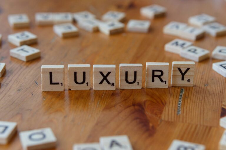
Purple is associated with luxury, creativity, wisdom, and imagination. Historically connected with royalty, it is often used by premium brands seeking a sophisticated and exclusive image.
Black in Branding
Black conveys elegance, authority, power, and sophistication. It is a popular choice among luxury, fashion, and automotive brands because it creates a premium and timeless appearance.
White in Branding
White symbolizes simplicity, cleanliness, transparency, and minimalism. It is commonly used in healthcare, technology, and lifestyle branding to create a modern and uncluttered visual identity.
Pink in Branding
Pink represents compassion, warmth, care, creativity, and playfulness. Different shades can communicate either softness and nurturing qualities or confidence and energy, making pink highly versatile in modern branding.
Brown in Branding
Brown is associated with authenticity, reliability, comfort, and tradition. It is often used by food, coffee, outdoor, and artisanal brands that want to emphasize quality, craftsmanship, and trustworthiness.
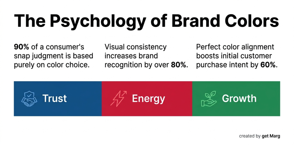
Data, Statistics, and Market Realities
The measurable impact of colours on consumer behaviour is backed by extensive market data across global industries. Visual consistency increases brand recognition by more than 80%, directly linking a fixed colour palette to long-term consumer recall.
When a brand colour aligns perfectly with the product category, consumers report a 60% higher intent to purchase during their first interaction. Conversely, poor contrast or unappealing colour choices on an e-commerce checkout page account for a 25% abandonment rate.
| Colour | Primary Psychological Association | Best Suited Industry | Brand Performance Impact |
| Blue | Trust, security, professional calm | Finance, tech, healthcare | Establishes 85% higher initial credibility |
| Red | Urgency, passion, physical energy | Food, entertainment, retail | Drives up to 34% more impulse interactions |
| Green | Growth, health, environmental peace | Sustainability, wellness, organic | Lowers psychological barriers by 40% |
| Yellow | Optimism, warmth, youthful clarity | Children’s brands, creative agencies | Increases immediate visual noticeability |
| Black | Luxury, premium authority, sophistication | High-end fashion, luxury vehicles | Command a 50% higher premium price point |
Understanding the emotional impact of colours in marketing allows you to design conversion funnels that work with human psychology, rather than against it.
How McDonald’s Masters Visual Psychology
The power of brand colour psychology is beautifully demonstrated by McDonald’s and their iconic use of red and yellow. The bright red stimulates the appetite and creates a subtle sense of physical urgency, encouraging faster customer turnover inside busy restaurants. Meanwhile, the vibrant yellow invokes feelings of happiness, optimism, and welcoming family warmth, visible from miles away on a highway.
When McDonald’s wanted to shift public perception in Europe toward a healthier, more eco-friendly image, they systematically replaced their red backgrounds with deep forest green. This deliberate change altered how the public viewed their stores without altering their core menu items, showcasing how colours drive brand perception. By shifting their visual foundation, they subtly communicated sustainability and premium quality, showing that a colour pivot can completely reframe a global entity.
Best Brand Colours by Industry
Common Colour Psychology Mistakes Brands Make
Avoiding common traps in visual design is just as important as selecting the right shades for your business. Outdated design methodologies frequently cause brands to lose traction in competitive digital spaces.
- Cloning the Market Leader: Copying your top competitor’s palette destroys your distinct identity and accidentally directs your hard-earned traffic back to them.
- Ignoring Digital Accessibility: Selecting low-contrast combinations like light grey text on a white background prevents a massive chunk of your audience from navigating your site.
- Overcomplicating the Palette: Using five or six dominant colours creates intense visual clutter that dilutes your brand colour psychology and confuses the eye.
- Disregarding Cultural Context: Forgetting that colours mean different things globally can ruin an international expansion, as white signals purity in the West but mourning in parts of Asia.
- Chasing Short-Term Trends: Building an identity around a highly specific “colour of the year” guarantees your brand will look outdated and stale within twenty-four months.
Partnering with an experienced team like GET Marg ensures your visual identity is built on timeless psychological principles rather than passing internet fads.
Colour Psychology Trends for 2026
As consumer expectations and digital experiences continue to evolve, colour psychology in branding is adapting to meet new market demands. While traditional colour associations remain important, modern brands are using colour more strategically to improve user experience, strengthen engagement, and enhance brand recognition.
Minimalist Branding
A growing trend in the psychology of colours in brand design is the shift toward minimalist branding. Many businesses are simplifying their colour palettes by focusing on one or two primary colours supported by neutral shades. This approach creates a clean, modern appearance and improves consistency across digital and physical touchpoints.
Accessibility-First Colour Systems
Brands are increasingly prioritizing accessibility by choosing colours with strong contrast and improved readability. This helps ensure content is accessible to all users while enhancing how colours affect brand perception and overall user experience.
AI-Driven Personalization
Advancements in AI and data analytics allow brands to test and optimize colour combinations based on customer preferences. This approach improves the impact of colours on consumer behaviour by delivering more personalized digital experiences.
Sustainable Colour Palettes
Nature-inspired shades such as green, brown, blue, and earthy neutrals are becoming more popular as brands emphasize sustainability. The emotional impact of colours in marketing helps communicate authenticity, environmental responsibility, and long-term brand values, making sustainable colour palettes a major trend for 2026 and beyond.
Cultivating Lasting Market Authority
Your visual identity is the silent ambassador of your business, working continuously to build trust long before a prospect speaks to a sales representative. When you master colour psychology in branding, you build an invisible bridge of credibility directly to your target consumer.
The ultimate goal of design is not to make your business look pretty; it is to make your business look like the definitive solution to a specific consumer problem. By taking a data-driven approach to your visual assets, you ensure your company stands out clearly in a noisy, distracted marketplace.
As you optimize your digital footprint for a fast-changing internet, every asset must work toward a single, unified growth goal. Your colour choices, your search presence, and your content architecture are all pieces of a single revenue engine.
Accelerate Your Growth Engine
Building a highly visible brand in a modern digital economy requires a flawless blend of striking visual strategy and technical marketing precision. At GET Marg, we serve as your modern growth partner, engineering comprehensive digital marketing, performance marketing, and advanced content strategies that capture true market authority.
Whether you need to refine your brand positioning, dominate modern AI search overviews, or scale your lead generation pipelines, our expert team provides the strategic guidance your business needs to grow. Let’s transform your brand into a market leader. Reach out to GET Marg today, and let’s design your next phase of digital growth.
Frequently Asked Questions(FAQs)
Q1. Is relying on standard brand colour psychology enough to stand out in a crowded market?
While brand colour psychology gives you the foundational emotional blueprint, true market differentiation requires contextual execution. You must use brand colour psychology to find gaps in your industry’s visual landscape so your brand stands out rather than blending in.
Q2. How do I balance the emotional impact of colours in marketing with digital accessibility standards?
Balancing the emotional impact of colours in marketing with accessibility means ensuring your text colours contrast sharply with your background choices. Web content accessibility guidelines require specific contrast ratios so that visually impaired users can read your strategic messaging perfectly.
Q3. How exactly do colours affect brand perception during a complete company rebrand?
When you change your colour palette, you alter the biological and emotional shortcuts consumers use to identify your business. Understanding how colours affect brand perception ensures that your new visual identity actively supports your updated business goals rather than confusing your existing audience.
Q4. How many colours should I include in my business logo colour psychology strategy?
For maximum clarity, stick to one dominant colour and one supporting accent colour in your logo colour psychology. Adding too many shades dilutes your identity and makes your logo difficult to reproduce clearly across small digital screens or physical merchandise.
Q5. What is the direct impact of colours on consumer behaviour in e-commerce?
The impact of colours on consumer behaviour is most visible on checkout pages and call-to-action buttons. A high-contrast button colour that stands out from the rest of the layout creates an immediate psychological prompt that reduces cart abandonment and boosts conversions.